
According to the Nielsen Norman Group, you have 10 crucial seconds to capture the attention of a visitor to your website before he or she clicks away. Most visitors leave within 10 to 20 seconds.
Therefore, your site’s homepage must pass this value proposition test: Within 10 seconds of first landing on your page, can a 13- to 15-year-old visitor understand the following?
- What do you offer?
- How will it make my life better?
- What do I need to do to take the next step?
This test may seem simple, but most ophthalmologists’ homepages do not pass it. Include the five elements outlined in this article, and you will have a much higher chance of passing the test.

Must-Have No. 1: Include your offer above the fold
When I say your offer, I do not mean a discount or a deal. I also do not mean a free consultation or an open evening (although these are perfectly good calls to action). Your offer, in this context, communicates to the potential patient what he or she will get from you. (We will come back to above the fold in a minute.)
“We offer vision correction” is an offer, but it does not stand out because all of your competitors, by definition, do the same. “We offer expert vision correction” is an offer, but it is weak because most prospective customers assume you are an expert. (Who wants amateur vision correction?) “We offer expert vision correction in [your city]” is a typical offer statement that search engine optimization (SEO)–minded website designers often suggest. This is a good offer for search engine robots, but it does little to entice humans. Mention this offer below the fold (that is, in a subheading).
Here are three better alternatives for your offer:
No. 1: Tell people what they get as a result of buying or using your services.
- “We offer freedom from glasses and contact lenses.”
This offer is good because it speaks to a benefit and says what the customer can expect after using your services But this offer could be better; it speaks to what most people want after vision correction, but it is generic.
No. 2: Promise an aspirational identity.
- “We’ll help you be the best golfer on the fairway.”
- “We’ll help you become the best version of yourself.”
- “We’ll help you face the world—free from barriers.”
You are not selling vision correction. You are selling transformation from a before state to an after state. Before your help, your patient blamed his or her poor long-game on bad eyesight. Now, after your help, he or she can aspire to cut his or her handicap. Before your help, your patient felt shy in social situations. Now, after your help, he or she can regain the confidence to boldly navigate social encounters.
No. 3: Promise to solve a problem.
- “We help 99.9% [or whatever number you can prove] of our patients achieve standard driving vision.”
- “We help you choose the best eye surgeon in [your city].”
- “We offer high-tech vision correction with a personalized touch.”
- “We help you overcome your fear about vision correction.”
- “We focus everything on getting you free of your glasses and contact lenses.”
- “We offer safe and effective vision correction affordable to everyone.”
By the time your visitor arrives at your website, it is likely he or she knows you offer freedom from glasses and contact lenses. However, choosing a surgeon or clinic is not easy, so you have an opportunity to guide a prospective patient through the maze of decision-making. Highlight your biggest strength in customer-centric language to alert your visitors that you are the one they are looking for to solve their problem.
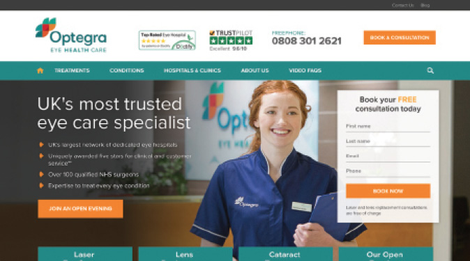
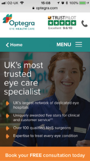
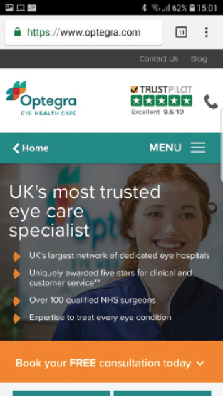
What does above the fold mean? You know what it means in that old medium, the newspaper: on the top half of the front page, where people will see it on the newsstand. But on the internet, above the fold refers to what the visitor sees before he or she starts to scroll down (Figures 1–3). This area changes from computer to computer, but today the most popular (19.28% of users) screen resolution is 1,366 x 768 pixels; 18.6% of users still use 1,024 x 766 pixels. This also changes between smartphones, as shown in Figures 2 and 3.

Figure 1. On the average computer, the area above the fold looks like this (image not to scale).

Figure 2. On an iPhone, the area above the fold looks like this.

Figure 3. On an Android phone, the area above the fold looks like this.
Think of the words above the fold as what you might say when first meeting a possible romantic partner; that is, they should be short, enticing, and exclusively customer-centric.
The words and pictures visitors see as they scroll down are what you want to share on the first and second dates. They should focus on building credibility and should show potential patients how to book an appointment.
TAKE-HOME MESSAGE
Look at your website and ensure that your offer is all of these things:
- Obvious: Set as a large headline and not buried in a paragraph of text;
- Enticing: Offers a benefit the customer gets after the service and not just what you do; and
- Distinctive: Sets you apart from your competitors, ideally promoting your most significant strengths (your ability; affability; availability; scope; or, at worst, price).

Must-Have No. 2: Highlight obvious calls to action
Consider your website as a container with the primary purpose of holding a call-to-action button. You are in the business of changing patients’ lives for the better, but you will soon be out of business if no one can find your call to action.
Put your call-to-action button in two places.
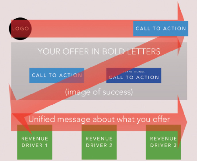
The visitor’s eye will most likely follow a Z pattern across your website (Figure 4), starting with your logo at the top-left corner, proceeding to your call-to-action button on the top-right corner, another call to action in the middle of the page, and to the bottom of the Z, where your subheading introduces your revenue streams: that is, the specific services you offer (see Must-Have No. 4). Figure 4. The eye follows a Z pattern above the fold. Make your call-to-action button stand out in a contrasting color that you can use for every call-to-action button on the website. Make it one of the brightest colors you use on your website, and avoid using that color for anything else. Use the same color and same text everywhere, again and again, many times on each and every page of your website. Choose your most important call to action (almost always a variation of “Book an Appointment”), and don’t clutter the area around the button with similar looking objects (text or icons). Many of the websites we design also offer transitional calls to action. Returning to our dating analogy, if your principal call to action is, “Will you go on a date with me?” your transitional call to action might be, “Can I have your phone number?” A transitional call to action is a lesser-value action that we want prospective visitors to take. Typically, a “Book an Appointment” button is the highest value, followed by others such “Ask for a Callback,” “Take This Free Self-Test,” and “Get Your Free Guide.” Set your transitional call-to-action button to the right of your primary call-to-action button in a less bright color, as shown in Figure 5. Figure 5. Example of primary and secondary (transitional) call-to-action buttons. Look at your website and ensure that you have two call-to-action buttons above the fold. The first invites visitors to do what you most want (ie, “Book an Appointment”), and the second asks them to take a smaller step. The words you choose are crucial, and the pictures you choose must support those words. Do not spend valuable above-the-fold space on your homepage displaying a photo of your building. Your potential patients are not buying your building, so do not waste their attention on things you do not offer. Similarly, don’t lead with an image of yourself. You are not the hero of your potential patient’s story: The patient is. You are the guide, but patients must see themselves in the image first. Feature pictures of authentic, smiling, happy people who are enjoying the results of vision correction with you. Very few people want to experience making a phone call, sitting in your waiting room, undergoing eye tests, or having eye surgery. Everyone wants what comes after all of that: enjoying their life after vision correction. Think like a travel company. Don’t illustrate the arduous journey. Do airline companies show travelers waiting in line, struggling with heavy luggage, sitting in cramped airplane seats, or negotiating with customs officers? Of course not! They show travelers enjoying their fantastic destination. Look at your website and ensure that it shows people who look like your patients doing all the things they want to do after you free them from glasses and contact lenses. Once you have communicated what you do for people, put your business hat on and identify how you make money. If you offer laser vision correction (SMILE, LASIK, PRK), find an overall umbrella message that unifies your different offerings. If you provide general ophthalmology, you may want to segment your services into age groups (eg, under 40 years of age, 40 to 60, 60 and above). Above the fold, state your unified message. This message could be something like the following: Then, as the visitor scrolls down the page, you might present your options as content boxes from which to choose. For laser vision correction, you might show your options as images of people engaged in specific activities that most align with the service’s benefit. Each of these content boxes can contain links to new pages with specific messages filtered by different customer avatars, the problems they have, the particular plans that suit their needs, and associated stories from patients that support these options. The unifying message, however, is either a customized treatment plan or specific age-appropriate care. You may think that your offerings are too diverse to communicate clearly. In most cases, you can find an umbrella theme to unite them. Once you have identified the umbrella message, you can plan different pages that focus on specific customer messaging. The fundamental objective is clarity. The more clear you are on the unifying benefits you offer, the more likely your visitors will see the path they should take to find what they seek. Look at your website and ensure that you are directing your visitors to learn more about your three most essential revenue drivers under a unifying theme. People, especially millennials, rarely read websites—they scan them. Most people skip long sections of text because they have been trained by marketers to ignore them. Most marketers write irrelevant and self-aggrandizing puffery that wastes visitors’ time with vague platitudes and hyperbolic claims lacking evidence. Many surgeons use text that looks like this: A Proud History of Excellence in Eye Care with LASIK and Cataract Surgery in [city]. Since our founding in 1929, the [name of clinic] has been a leader in eye care diagnostic and surgical procedures. Over the years, our surgeons have done much to pioneer breakthrough treatments so that today we are able to provide the very highest level of patient care possible. The passage above focuses exclusively on making the clinic and the surgeons the hero of the patients’ story. Instead, your website should say something like this (in essence): I offer a life without glasses. Life without glasses is good. You want that life and should call me now to get it. As your visitor scrolls down your page, you can use more words and tell them about your history using evidence and proof from social media to highlight your credibility. Not too many words, though. Think about it this way: Write 10 tweets instead of 10 paragraphs. If you want to include more text on your website to either explain something in more depth or to boost your site’s search engine optimization, place a “Read More” link that expands into more text for those who are interested. Those who want to know more will click. The rest will call you to learn more, which is what you want most. Look at your website and see if you can do these things: Brevity is the soul of wit and the heart of lead generation. At the heart of lead generation is the ability to communicate efficiently. That is not easy. It is much harder to communicate meaningfully using few words. On their homepages, most clinics ramble on about themselves, hoping something will connect with consumers. The reality, however, is that your prospects will not read that rambling text, especially if it is all about you and not about them. Like you, your patients are time-poor. They will not do your work for you. They expect to understand the essence of who you are and what you offer within a few seconds. If not, they will not connect to your message, and they will move on to your competitor’s website. It happens every day. So, take your potential patients by the hand and give them a fast and easy way to realize that they are in the right place: Follow these five pointers and you will have a significantly more effective homepage. As long as you stay on message, more people will read more of what you write, and you will convert more visitors into leads. By David Evans, PhD, MBA Simple website coding errors can have catastrophic consequences on your hard-fought search rankings, traffic, and revenue. Is your site at risk? Off-the-shelf websites are easy to implement, but, in many cases, these platforms include underlying coding issues that are not search-engine friendly. This is compounded by the fact that web developers who build a website with off-the-shelf platforms typically do not have the skillset required to write code to offset these critical search engine optimization (SEO) issues or even detect the problematic internal coding problems. Clean code can ensure the maximum return on this investment. Here, I share three flaws that, once fixed with my call to action suggestions, can help to ensure that your website is functioning at its best ability. Flaw No. 1: Index Bloat Google is ruthless in penalizing sites with duplicate pages or an excessive number of low-quality pages with limited or no content, only images. Unfortunately, many of the popular website platforms such as WordPress and SquareSpace automatically create duplicate pages for blog posts, individual gallery photos, and graphic images. Also, hackers are constantly attempting to add multiple low-quality pages to these sites. It is not unusual to find hacked sites with twice as many pirated pages as primary content pages. So-called index bloat problems can be fixed by either removing the pages, or, if they are needed, de-indexing them. De-indexing involves placing code on these pages telling Google not to include them in its index. Call to action: Ask your SEO company to regularly track the number of pages in your Google index and to remove or de-index the duplicate or low-quality ones. By regularly checking, it will be able to detect any additional pages due to hacking activity. Flaw No. 2: Excessive 404 Errors A 404 error occurs when a website visitor or search engine crawler attempts to visit a page on the site that does not exist. If a website visitor simply types in the incorrect URL for the site, rankings are not affected. However, if the error occurs due to improper code, Google will penalize the site’s rankings. These issues can be readily identified through a broken link report and the 404 error report within Google Webmaster Tools. These should be checked regularly because off-the-shelf platforms often automatically create links within the site, and sometimes the links are incorrect, resulting in 404s. Call to action: Ask your SEO company if it regularly reviews 404 error reports and fix the 404s. If it doesn’t, tell them they need to start. Flaw No. 3: Slow Loading Speed Site load speed has become an important ranking factor for Google. Easily fixable coding issues can cause slow load speeds. The most common issues are image size and out-of-date plug-ins. These can be cured by ensuring that all images on the site are compressed and by regularly updating plug-ins. Call to action: Ask your SEO company to compress all images on your website and to ensure that the plug-ins are updated at least two to three times a year.


TAKE-HOME MESSAGE

Must-Have No. 3: Feature images of success
TAKE-HOME MESSAGE

Must-Have No. 4: Display a bite-sized breakdown of your revenue streams
TAKE-HOME MESSAGE

Must-Have No. 5: Show very few words, and not one of them should deviate from your core message
TAKE-HOME MESSAGE
BREVITY RULES
FIX THESE WEBSITE FLAWS NOW


